Why Your QR Code Won’t Scan — 9 Fixes That Actually Workلماذا لا يُمسح رمز QR — ٩ حلول مجرّبة
QR codes that don’t scan rarely fail for one big reason. Here are the nine specific fixes — quiet zone, contrast, error correction, size, surface, logo placement, browser, and more — ranked by how often they’re actually the culprit.رموز QR التي لا تُمسح نادراً ما تفشل لسبب واحد كبير. إليك الحلول التسعة المحدّدة — المنطقة الهادئة، التباين، تصحيح الأخطاء، المقاس، السطح، موضع الشعار، المتصفّح، وأكثر — مرتّبة حسب تكرار كونها السبب الفعلي.
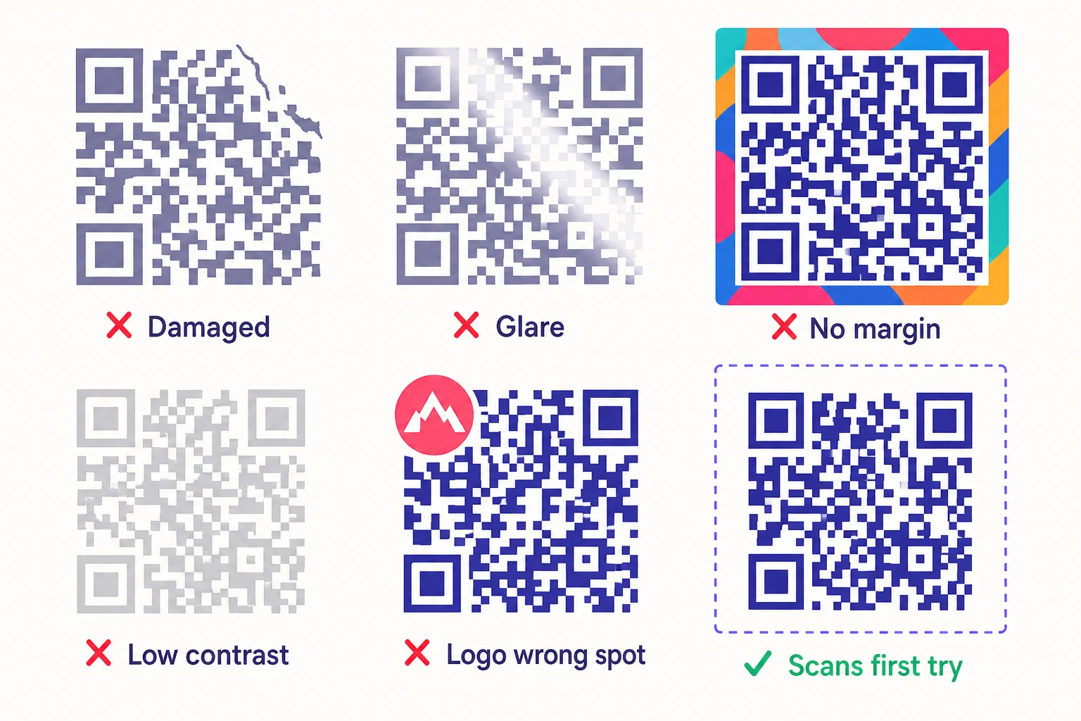
A QR code that doesn’t scan rarely fails for one big reason. It usually fails for one of about nine specific small reasons, and once you know which it is, the fix takes a minute. Here are those nine, in roughly the order they appear in real-world print disasters — most common first.
1. The quiet zone is missing or crowded
Every QR code requires a clear margin around it — at least four modules wide, with no other content inside. This is the quiet zone. A QR placed flush against a frame, a logo, or a text block can fail entirely even if the code itself is otherwise perfect. The quiet zone is part of the code, not optional padding around it.
2. Contrast is too low
Scanners need crisp light–dark contrast to find module edges. Black on white is the gold standard. A muted gray on cream, or two colours close in luminance, can make modules unreadable even though they look fine to your eye. Inverted codes (light modules on a dark background) work in theory but break on many older phone scanners that assume dark-on-light.
Fix: stick to dark-on-light with a contrast ratio of at least 4:1. If you must use brand colours, test on at least three phones — older Android cameras are the strict ones.
3. The code is printed too small
The 10:1 rule: minimum reliable scan distance is roughly ten times the printed code width. A 1 cm QR scans up to about 10 cm. A 5 cm QR up to half a metre. If you’ve printed a 2 cm code on a poster meant to be scanned from a metre away, it can’t be read no matter how perfect the design is.
Fix: print bigger. As a rule of thumb, the QR should fill 30-50% of the camera frame at the expected scan distance.
4. A logo is covering a structural region
Error correction lets a QR survive damage to the data area. It does NOT protect the structural elements — the three big finder patterns in the corners, the alignment pattern in the bottom-right area, and the timing-pattern row and column. A logo placed over any of these breaks the code immediately, regardless of error-correction level.
Fix: keep logos centred over the data area only. Most generators (including QRA) prevent logos from drifting onto structural regions automatically.
5. The logo is too big for the chosen error-correction level
Even when correctly placed, a logo that exceeds the error-correction budget overwrites more data than the code can recover. At level M (the default in most generators) the safe ceiling is about 15% of the code area; at H (the maximum) it’s about 30%. Push past either and scans get unreliable, especially in low light or on older phones.
Fix: shrink the logo, or bump the error-correction level (L → M → Q → H). Going from M to H lets you use a larger logo, but it also makes the QR slightly larger physically for the same data, so verify your print size still works.
6. Glare or reflective surface is hiding modules
Glossy stickers, laminated cards, varnished menus, glass storefronts — any reflective surface can produce a glare patch that hides modules from the camera. Outdoor signage in direct sunlight is the worst offender.
Fix: use matte print where possible. If glossy is required, place the code where direct lighting won’t hit it head-on. Outdoors, choose a position that’s shaded or angled away from the sun’s typical path.
7. The surface is curved or distorted
QR codes assume a flat plane. On cans, cups, bottles, water-filled labels, or wrapped poles, perspective distortion warps the modules. Codes can survive mild curvature thanks to the alignment pattern, but anything tighter than a 5 cm radius starts to fail.
Fix: size up by 20-30% for curved surfaces, and consider raising the error-correction level to compensate for the effective resolution loss.
8. The destination URL is broken
A perfectly-scannable code can still feel broken to a user if the URL it points to no longer works — a 404, a deleted social profile, a campaign landing page that was taken down. To the scanner, the QR worked. To the customer, it’s a dead end.
Fix: this is the killer feature of dynamic QR codes — you can edit the destination after printing, without reprinting the code. If you’re using static codes today and a destination dies, your only option is to print over them with stickers carrying new codes. Move to dynamic and this entire failure mode disappears.
9. The phone’s camera or browser is the problem (rare but real)
Older Android cameras and budget Chinese-market phones occasionally struggle with codes that work fine on iPhones and modern flagships. Some browsers strip URL parameters or block non-HTTPS destinations. A few corporate networks block QR-shortener domains entirely. None of these are your fault, but they all make a code feel “broken” to the affected user.
Fix: there’s no perfect fix, but you can minimise the surface area. Use HTTPS destinations always. Avoid URL shorteners with sketchy reputations. If you control the audience’s devices (e.g. corporate event), test on a representative phone before printing.
The diagnostic order
- Look at the print: is there a generous quiet zone? If no — that’s it.
- Is the contrast obviously dark-on-light? If no — fix the colours.
- Is the printed code at least 30% of the camera frame at scan distance? If no — print bigger.
- Is the logo (if any) inside the data area only, and small enough for the EC level? If no — fix placement or shrink.
- Is there glare on the surface? If yes — re-light or matte the print.
- Is the surface curved? If yes — size up.
- Try the destination URL in a browser directly. If broken — fix the URL (or move to dynamic so you can fix it next time without reprinting).
How QRA helps
QRA’s designer enforces the quiet zone automatically, prevents logos from drifting onto structural regions, bumps the error-correction level when you embed a larger logo, and recommends a minimum print size based on your data length. The live preview re-validates on every change, so most of these failure modes are caught before you export. And because every dynamic code routes through qra.cc, you can edit the destination after printing — fix #8 disappears entirely.
The short answer
If your QR isn’t scanning, work the list in order. Quiet zone, contrast, size, logo placement, logo size, glare, curvature, dead URL, audience’s phone. The first match is almost always the answer, and the fix is usually a one-minute change.
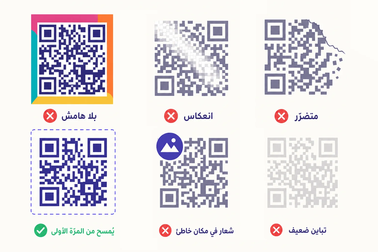
رمز QR الذي لا يُمسح نادراً ما يفشل لسبب واحد كبير. عادةً ما يفشل لسبب واحد من تسعة أسباب صغيرة محدّدة، وحالما تعرف أيّها هو السبب، يأخذ الإصلاح دقيقة واحدة. إليك التسعة، تقريباً بالترتيب الذي تظهر فيه في كوارث الطباعة الواقعية — الأكثر شيوعاً أوّلاً.
١. المنطقة الهادئة مفقودة أو مزدحمة
كل رمز QR يستلزم هامشاً صافياً حوله — لا يقلّ عن أربع وحدات عرضاً، ولا يحوي أيّ محتوى آخر. هذه هي المنطقة الهادئة. رمز موضوع ملاصقاً لإطار أو شعار أو كتلة نص قد يفشل تماماً حتّى لو كان الرمز نفسه مثاليّاً. المنطقة الهادئة جزء من الرمز، لا حشوة اختياريّة حوله.
٢. التباين منخفض جدّاً
تحتاج الماسحات إلى تباين فاتح–داكن واضح للعثور على حواف الوحدات. الأسود على الأبيض هو المعيار الذهبي. الرمادي الباهت على الكريمي، أو لونان متقاربان في السطوع، يجعلان الوحدات غير قابلة للقراءة حتّى لو بدت لعينك سليمة. الرموز المعكوسة (وحدات فاتحة على خلفية داكنة) تعمل نظريّاً لكنّها تكسر كثيراً من ماسحات الهواتف القديمة التي تفترض داكن-على-فاتح.
الإصلاح: التزم بداكن-على-فاتح بنسبة تباين لا تقلّ عن ٤:١. إن وجب استخدام ألوان العلامة التجارية، فاختبر على ثلاثة هواتف على الأقل — كاميرات أندرويد القديمة هي الأكثر صرامة.
٣. الرمز مطبوع بحجم صغير جدّاً
قاعدة ١٠:١: أقصى مسافة مسح موثوقة تساوي تقريباً عشرة أضعاف عرض الرمز المطبوع. رمز ١ سم يُمسح حتّى نحو ١٠ سم. رمز ٥ سم حتّى نصف متر. إن طبعت رمز ٢ سم على ملصق يُفترض أن يُمسح من على بُعد متر، فلن يُقرأ مهما كان التصميم مثاليّاً.
الإصلاح: اطبع أكبر. كقاعدة عمليّة، يجب أن يملأ الرمز ٣٠-٥٠٪ من إطار الكاميرا عند مسافة المسح المتوقّعة.
٤. شعار يغطّي منطقة بنيويّة
تصحيح الأخطاء يسمح للرمز بالنجاة من ضرر منطقة البيانات. وهو لا يحمي العناصر البنيويّة — أنماط التحديد الكبيرة الثلاثة في الزوايا، ونمط المحاذاة في المنطقة السفلية اليمنى، وصف وعمود نمط التوقيت. شعار موضوع فوق أيّ من هذه يكسر الرمز فوراً، بصرف النظر عن مستوى تصحيح الأخطاء.
الإصلاح: ابقِ الشعارات في وسط منطقة البيانات فقط. معظم المولّدات (بما فيها QRA) تمنع الشعارات من الانزياح إلى المناطق البنيويّة تلقائيّاً.
٥. الشعار كبير جدّاً لمستوى تصحيح الأخطاء المختار
حتّى عند الموضع الصحيح، شعار يتجاوز ميزانية تصحيح الأخطاء يطمس بيانات أكثر ممّا يستطيع الرمز استعادته. عند المستوى M (الافتراضي في معظم المولّدات) السقف الآمن يبلغ نحو ١٥٪ من مساحة الرمز؛ وعند H (الأقصى) نحو ٣٠٪. تجاوز أيّاً منهما، يصبح المسح غير موثوق، خصوصاً في الإضاءة الضعيفة أو على الهواتف القديمة.
الإصلاح: قلّص الشعار، أو ارفع مستوى تصحيح الأخطاء (L ← M ← Q ← H). الانتقال من M إلى H يتيح شعاراً أكبر، لكنّه أيضاً يجعل الرمز أكبر فيزيائيّاً للبيانات نفسها، فتحقّق من أنّ مقاس الطباعة لا يزال صالحاً.
٦. انعكاس أو سطح لامع يخفي الوحدات
الملصقات اللامعة، البطاقات الملمّعة، القوائم المغطّاة بالورنيش، واجهات المتاجر الزجاجيّة — كلّ سطح عاكس قد يُنتج بقعة انعكاس تخفي الوحدات عن الكاميرا. اللافتات الخارجيّة في ضوء الشمس المباشر هي الأسوأ.
الإصلاح: استخدم طباعة مطفية كلّما أمكن. إن وجب استخدام اللامع، ضع الرمز في مكان لا تصيبه فيه إضاءة مباشرة وجهيّاً. في الخارج، اختر موضعاً مظلّلاً أو بعيداً عن مسار الشمس المعتاد.
٧. السطح منحنٍ أو مشوّه
تفترض رموز QR سطحاً مستوياً. على العلب، الأكواب، القارورات، الملصقات حول قارورات الماء، أو الأعمدة الملفوفة، يشوّه المنظور الوحدات. تستطيع الرموز النجاة من انحناء خفيف بفضل نمط المحاذاة، لكنّ أيّ شيء أضيق من نصف قطر ٥ سم يبدأ بالفشل.
الإصلاح: كبّر بـ ٢٠-٣٠٪ للأسطح المنحنية، وفكّر في رفع مستوى تصحيح الأخطاء لتعويض الخسارة الفعليّة في الدقّة.
٨. رابط الوجهة معطّل
رمز قابل للمسح بشكل ممتاز يمكن أن يبدو معطّلاً للمستخدم إن كان الرابط الذي يشير إليه لم يعد يعمل — صفحة ٤٠٤، حساب اجتماعي محذوف، صفحة هبوط لحملة أُغلقت. بالنسبة للماسح، الرمز عمل. بالنسبة للعميل، طريق مسدود.
الإصلاح: هذه هي الميزة الفاتكة للرموز الديناميكيّة — يمكنك تعديل الوجهة بعد الطباعة، دون إعادة طباعة الرمز. إن كنت تستخدم اليوم رموزاً ثابتة وماتت وجهة، فخيارك الوحيد لصق ملصقات تحمل رموزاً جديدة. انتقل إلى الديناميكي، ويختفي هذا النوع من الفشل تماماً.
٩. كاميرا الهاتف أو المتصفّح هي المشكلة (نادر لكنّه حقيقي)
كاميرات أندرويد الأقدم وهواتف السوق الصيني الاقتصاديّة تجد أحياناً صعوبة في رموز تعمل بشكل جيّد على iPhone والهواتف الحديثة الراقية. بعض المتصفّحات تُسقط معاملات الرابط أو تحجب وجهات غير HTTPS. وقلّة من شبكات الشركات تحجب نطاقات مختصرات الروابط كليّاً. لا شيء من هذا خطؤك، لكنّها كلّها تجعل الرمز يبدو «مكسوراً» للمستخدم المتأثّر.
الإصلاح: لا حلّ مثالي، لكن يمكنك تقليص مساحة المشكلة. استخدم وجهات HTTPS دائماً. تجنّب مختصرات الروابط ذات السمعة المشكوك بها. إن كنت تتحكّم بأجهزة الجمهور (مثلاً فعالية شركة)، فاختبر على هاتف ممثّل قبل الطباعة.
ترتيب التشخيص
- انظر إلى المطبوع: هل توجد منطقة هادئة سخيّة؟ إن لم توجد — هذه هي.
- هل التباين واضح داكن-على-فاتح؟ إن لم يكن — أصلح الألوان.
- هل الرمز المطبوع لا يقلّ عن ٣٠٪ من إطار الكاميرا عند مسافة المسح؟ إن لم يكن — اطبع أكبر.
- هل الشعار (إن وُجد) داخل منطقة البيانات فقط، وصغير بما يكفي لمستوى EC؟ إن لم يكن — أصلح الموضع أو قلّص.
- هل هناك انعكاس على السطح؟ إن نعم — أعد الإضاءة أو اطبع مطفياً.
- هل السطح منحنٍ؟ إن نعم — كبّر.
- جرّب رابط الوجهة في متصفّح مباشرة. إن كان معطّلاً — أصلح الرابط (أو انتقل إلى الديناميكي لتُصلحه في المرّة القادمة دون إعادة طباعة).
كيف تساعدك QRA
مصمّم QRA يفرض المنطقة الهادئة تلقائيّاً، ويمنع الشعارات من الانزياح إلى المناطق البنيويّة، ويرفع مستوى تصحيح الأخطاء حين تدرج شعاراً أكبر، ويوصي بحدّ أدنى لمقاس الطباعة بناءً على طول بياناتك. المعاينة الحيّة تُعاد التحقّق منها عند كلّ تعديل، فيُلتقط معظم أنماط الفشل هذه قبل التصدير. وبما أنّ كلّ رمز ديناميكي يُوجَّه عبر qra.cc، يمكنك تعديل الوجهة بعد الطباعة — ويختفي الإصلاح رقم ٨ تماماً.
الإجابة المختصرة
إن لم يُمسح رمزك، اعمل القائمة بالترتيب. منطقة هادئة، تباين، مقاس، موضع الشعار، حجم الشعار، انعكاس، انحناء، رابط ميّت، هاتف الجمهور. أوّل تطابق يكون دائماً تقريباً هو الإجابة، والإصلاح عادةً تغيير دقيقة واحدة.
Ready to make a smarter QR?جاهز لإنشاء رمز QR أذكى؟
Sign up free — no card needed. Track every scan, edit destinations anytime.سجّل مجاناً — بدون بطاقة. تتبّع كل عملية مسح وعدّل الوجهة في أي وقت.