Arabic-First Landing Pages: How QR Destinations Should Be Designed for MENAصفحات الهبوط بالعربيّة أوّلاً: كيف تُصمَّم وجهات QR للشرق الأوسط
Most QR destination pages built for MENA visitors are English-default with an Arabic toggle bolted on as an afterthought. They scan correctly. They convert poorly. Arabic-first design isn't translation — it's typography, layout, eye-flow, button placement, and form behaviour treated as first-class for Arabic readers. Here's how it differs from translated-from-English design, and why the conversion numbers move when you get it right.معظم صفحات وجهات QR المبنيّة لزوّار الشرق الأوسط افتراضيّة-بالإنجليزيّة مع زرّ عربي مُلصق كفكرة لاحقة. تُمسح بشكل صحيح. تحوّل بشكل ضعيف. التصميم بالعربيّة أوّلاً ليس ترجمة — هو الخطّ والتخطيط وتدفّق العين وموضع الأزرار وسلوك النماذج كلّها معاملةً من الدرجة الأولى لقرّاء العربيّة. إليك كيف يختلف عن التصميم المُترجَم-من-الإنجليزيّة، ولماذا تتحرّك أرقام التحويل حين تنجح فيه.
Most QR campaigns aimed at MENA visitors fail the same way. The QR generates correctly. It scans correctly. It opens the destination page correctly. And then the page that loads is an English-default landing page with an Arabic toggle bolted onto the top-right corner — translation handled, layout untouched. The destination 'works' technically. It converts at a fraction of what it could because the design treated Arabic readers as a translation accommodation, not as first-class users.
The shift from translation-driven to truly Arabic-first design is the difference between 'the visitor can read it' and 'the visitor wants to act on it'. This piece is for designers, marketers, founders, and product teams building anything in MENA that will be entered through a QR scan — and especially for global brands setting up regional landing-page work for the first time. Most of the mistakes are subtle. All of them are visible to Arabic readers on the first second of the page load, even when they can't articulate exactly what's wrong.
What 'Arabic-first' actually means
Arabic-first design is the practice of treating the Arabic reader's perception, eye-flow, and interaction patterns as the primary design constraint, with English readers accommodated through a toggle and a parallel layout. The opposite — English-first design with an Arabic toggle — is what most global brands ship into MENA by default, and it consistently underperforms locally-built work.
Arabic-first is NOT just RTL layout. RTL is the structural starting point — text flows right-to-left, layout mirrors, components flip — but Arabic-first goes further: typography choices, eye-flow assumptions, button placement, form-field order, error-state behaviour, and even motion/transition direction all change. A page that flips its text direction but keeps the English-derived layout instincts is still translated-from-English design at heart. It just reads right-to-left.
Eight design dimensions where Arabic-first differs from translated
1. The eye-start corner
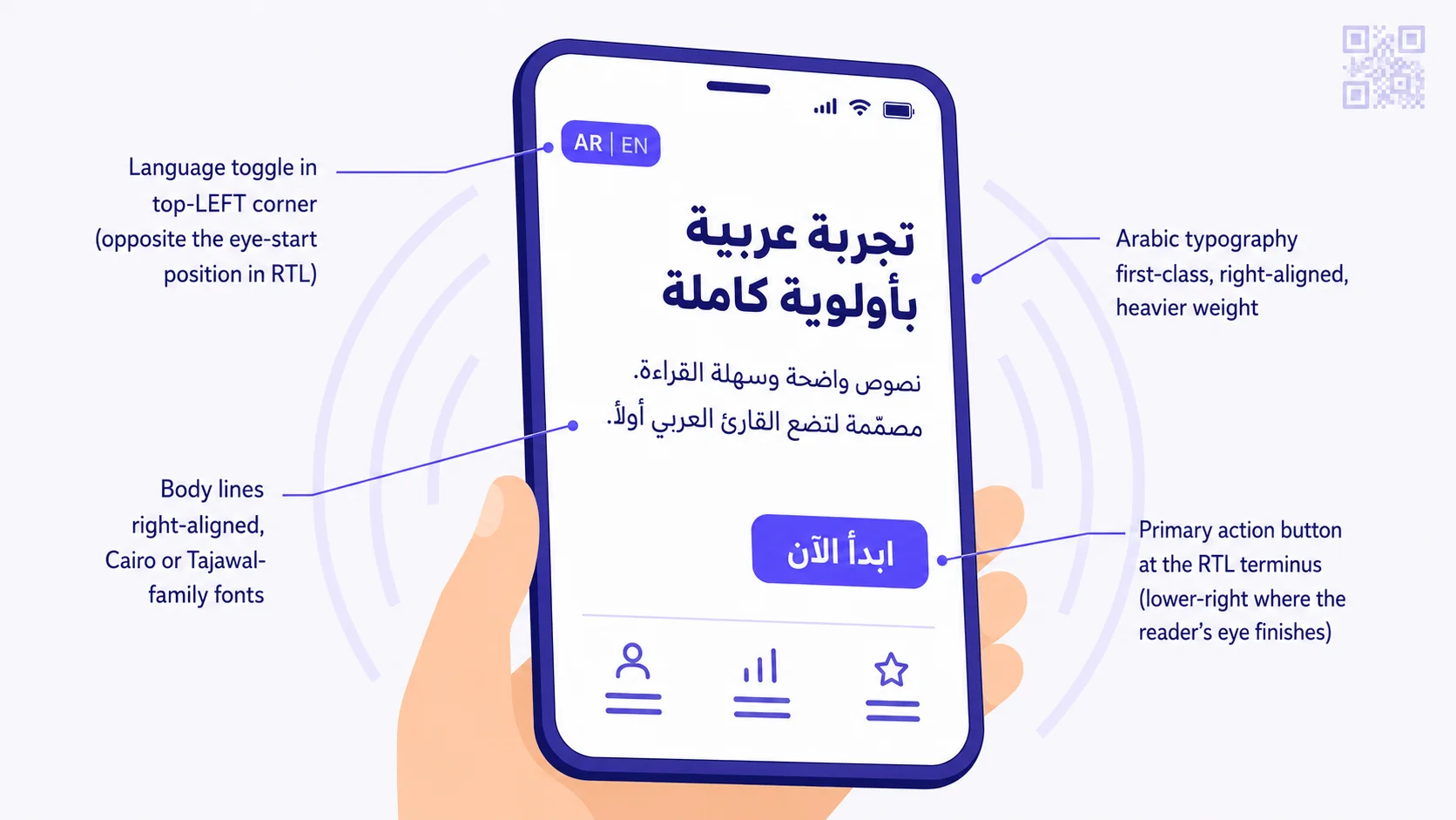
English readers' eyes land on the top-LEFT of any page. Arabic readers' eyes land on the top-RIGHT. This is the single most consequential difference, and it shapes every other layout decision. The hero headline, primary brand element, and call-to-action visual hierarchy must respect where the eye actually starts. A logo that sits in the top-LEFT for an English-first design needs to MOVE to the top-RIGHT for Arabic-first — not just flip its position via CSS, but be designed to read as the page's entry point from that side.
2. The reading terminus and primary action button
English-first design places the primary call-to-action button on the lower-LEFT or lower-CENTRE of the content area, because that's where the LTR reader's eye finishes scanning the content above. Arabic-first design places it on the lower-RIGHT — the natural terminus of an RTL reader's eye flow. This is one of the most-violated rules in MENA web design. Brands ship Arabic pages with the primary CTA still on the left, and the Arabic reader has to do a small involuntary scan-back to find it. That micro-friction compounds across the page and lowers conversion meaningfully.
3. The language toggle placement
If your page defaults to Arabic-visible and offers an English toggle, that toggle should sit in the TOP-LEFT corner — opposite the eye-start position. The reasoning: the language toggle is a 'safety net' element, used when the default doesn't fit the reader. Placing it opposite the eye-start makes it visible at peripheral vision without competing for primary attention. Conversely, on an English-default page, the Arabic toggle goes on the top-RIGHT (opposite the LTR eye-start). The toggle's job is to be findable when needed, not to dominate when not needed.
4. Typography weight, size, and family
Arabic typography is not a translated character set — it's a typographic system with its own anatomy. Arabic glyphs are denser, more horizontal, and require different rhythm than Latin glyphs. Three practical implications:
- Use Arabic-designed fonts (Cairo, Tajawal, IBM Plex Arabic, Noto Naskh Arabic, Frank Ruhl) rather than the auto-substituted Arabic glyphs that appear when you set a Latin font like Helvetica or Inter on Arabic content. Auto-substitution is almost always uglier than purposeful Arabic typeface choice.
- Arabic typography typically renders LARGER than Latin at the same body-text size — bump body text up 1-2 points (or 1-2 px in CSS) to maintain reading rhythm. A 14 px Latin body usually corresponds to 15-16 px Arabic body for comparable comfort.
- Heavier weight is acceptable and often appropriate for Arabic headlines in a way that would feel aggressive in Latin. Arabic letterforms can carry visual weight without looking shouty.
5. Form-field order and label position
Forms designed Arabic-first reverse the field order in horizontally-paired fields (first-name + last-name in Arabic order = الاسم الأخير on the right, الاسم الأوّل on the left — opposite the Latin convention). Labels above fields stay above; labels left of fields move to the right; placeholder text aligns right; validation messages appear with the appropriate alignment and direction. Phone-number fields with a country-code dropdown place the dropdown on the right of the input (opposite the LTR convention), because Arabic readers' eyes process the country code first, then the digit sequence.
6. Numbers, dates, and direction of progress
This one trips up everyone. Arabic text reads right-to-left, but Arabic-INDIC numerals (٠١٢٣٤٥٦٧٨٩) within Arabic text are read LEFT-to-RIGHT for multi-digit numbers (123 is read as 'one-hundred-twenty-three', same as in English, with the leading digit visually positioned where you'd expect). So a price '٥٠٠ ر.س' is laid out with the digits LTR-ordered within the otherwise-RTL line. This means CSS rules need to handle bi-directional content correctly — the browser's bidi algorithm usually does, but designers need to verify the resulting layout doesn't break.
Date formatting in MENA is mixed — Arabic numerals (Western 1234567890) are widely accepted alongside Arabic-Indic ones. Convention varies by country: Saudi Arabia mostly Western numerals in business contexts, Egypt and the Levant slightly more Arabic-Indic, the Gulf private sector commonly bilingual. Default to Western numerals with the Arabic-Indic option as a toggle if your audience preference isn't clear.
Progress bars, step indicators, breadcrumbs, and back-buttons reverse direction in RTL — forward motion is leftward, back motion is rightward. A step indicator with '1 → 2 → 3' becomes '٣ ← ٢ ← ١' (read from right to left, arrows pointing left, current step typically the rightmost). Brands ship progress UI with arrows still pointing right in Arabic mode constantly. It looks wrong to native readers.
7. Iconography and directional symbols
Most icons are direction-neutral and work the same in either layout: a phone, an envelope, a globe, a star. But directional icons need to flip: a back-arrow icon pointing left in LTR points right in RTL; a forward chevron in a button points left in RTL; a 'reply' icon's curve mirrors. CSS-only solutions exist (transform: scaleX(-1)) but they don't help if your icon set was hand-drawn with embedded directional logic. Audit your icon set for direction-bearing elements before declaring it RTL-safe.
8. Trust signals localised to the region
The trust signals that work in MENA differ from the trust signals that work globally. Specific examples that move the conversion needle for MENA audiences:
- Local payment-scheme badges (mada in KSA, MEEZA in Egypt, KNET in Kuwait, Aani in UAE) — much higher trust value than 'we accept Visa and Mastercard'.
- Halal certification badges where relevant (food, financial services, certain consumer products).
- Saudi-issued commercial registration numbers (CR), VAT registration, ZATCA compliance badges for KSA-targeted commerce.
- Bilingual customer-support hours displayed in local timezone (AST/AET/EET/CET as appropriate).
- Trust signals avoided in some Gulf markets: certain Western-secular imagery in product photography (yoga poses, certain swimwear, alcohol-adjacent imagery).
What changes when you do it right
Brands that move from translated-from-English to genuinely Arabic-first landing pages typically see meaningful conversion improvements — the exact numbers vary by category and starting baseline, but the pattern is consistent. The reader's experience goes from 'I can understand this page' to 'this page is for me'. The cognitive friction of micro-mismatches (button on the wrong side, font feeling foreign, language toggle dominating because it's on the eye-start corner) disappears, and the action — book, buy, scan-to-pay, sign-up, contact — feels natural rather than effortful.
The investment is modest. Re-laying out a landing page Arabic-first is a 1-3 day designer task, not a multi-week rebuild. The work scales — once you've established the design system's RTL component variants, every subsequent landing page inherits them. The first one is expensive in design hours; the tenth one is automatic.
Where QR destinations specifically need this attention
Three QR destination contexts where Arabic-first design matters disproportionately:
Restaurant and hospitality menus
A guest at a Riyadh, Cairo, or Dubai cafe table scanning a QR menu is in a high-friction-intolerant moment. The destination page has to feel like the cafe, in the guest's reading direction, with the eye-flow that matches how they expect to scan a menu. Arabic-first menus open to the Arabic content visible, with English available — not the reverse.
Marketing campaign landing pages
A campaign QR that converts at half its potential because the design favoured English readers is leaving real money on the table. Localised, Arabic-first variants of campaign pages routinely outperform their direct-translated counterparts, and the deployment cost is incremental given the underlying campaign already exists.
Payment QR checkout pages
Payment friction matters more than anywhere else — every micro-doubt the visitor experiences during checkout becomes an abandoned cart. Arabic-first checkout flows feel familiar; mada/MEEZA/KNET trust badges in their native script; bilingual local phone-support numbers; bidi-correct date and amount formatting; all flow into completion rate.
Common patterns to avoid
- Auto-detecting language by browser locale and forcing it without a visible toggle — many MENA users keep their phone in English while reading Arabic, and language-by-locale gets it wrong constantly.
- Using Helvetica, Arial, or Inter for Arabic content — the auto-substituted Arabic glyphs look cheap.
- Forgetting to flip icon direction — most common offender: back-arrow icons that point left in both EN and AR layouts.
- Submitting a form and showing a success state that's still left-aligned in the RTL view because the success component wasn't audited.
- Numerals that flip the wrong way — a phone number like +966 50 123 4567 should not become 7654 321 50 669+ when the page goes RTL.
- Currency symbols on the wrong side — SAR sits AFTER the number in Arabic ('٥٠٠ ر.س' or '500 ر.س'), not before.
How QRA handles destination pages
QRA's QR destination pages render Arabic-first by default with an English toggle in the top-LEFT corner — the inverse of how most global SaaS handles MENA. Typography defaults to Cairo / Tajawal-family Arabic fonts; numerals respect bidi correctness; primary CTA buttons sit on the lower-right at the RTL terminus; form fields and labels flip correctly for paired inputs; trust badges (mada / MEEZA / KNET / VAT / CR / ZATCA) render in their native script. For destination pages with custom HTML/CSS hosted outside QRA, the platform provides RTL component templates and an Arabic-first design audit as part of pro-tier onboarding.
The short answer
Arabic-first design isn't translation. It's typography, layout, eye-flow, button placement, form behaviour, iconography, and trust-signal selection all treated as first-class for Arabic readers, with English readers accommodated through a parallel layout and a top-LEFT language toggle. The investment is modest; the conversion lift is real and durable. For any QR campaign targeting MENA, the destination page is the moment the visitor decides whether to act — design that moment for them, not at them. Translation is the entry-level effort; Arabic-first is the work that actually compounds.
تفشل معظم حملات QR الموجَّهة لزوّار الشرق الأوسط بالطريقة نفسها. يُولَّد الرمز بشكل صحيح. يُمسح بشكل صحيح. يفتح صفحة الوجهة بشكل صحيح. ثمّ تكون الصفحة التي تُحمَّل صفحة هبوط افتراضيّة-بالإنجليزيّة مع زرّ عربي مُلصق على الزاوية العلويّة-اليمنى — الترجمة منجزة، والتخطيط لم يُلمَس. الوجهة «تعمل» تقنيّاً. تحوّل بجزء بسيط ممّا تستطيع لأنّ التصميم عامل قرّاء العربيّة كتسهيل ترجمة، لا كمستخدمين من الدرجة الأولى.
الانتقال من التصميم المدفوع-بالترجمة إلى التصميم بالعربيّة-أوّلاً حقيقيّاً هو الفرق بين «يستطيع الزائر قراءته» و«يريد الزائر التصرّف بناءً عليه». هذا المقال موجَّه للمصمّمين، والمسوّقين، والمؤسّسين، وفرق المنتج الذين يبنون أيّ شيء في الشرق الأوسط يُدخَل عبر مسحة QR — وخاصّةً للعلامات التجاريّة العالميّة التي تُعدّ عمل صفحات الهبوط الإقليميّة للمرّة الأولى. معظم الأخطاء دقيقة. كلّها مرئيّة لقرّاء العربيّة في الثانية الأولى من تحميل الصفحة، حتّى حين لا يستطيعون التعبير بدقّة عمّا هو خاطئ.
ما تعنيه «العربيّة أوّلاً» فعلاً
التصميم بالعربيّة أوّلاً هو ممارسة معاملة إدراك القارئ العربي، وتدفّق عينه، وأنماط تفاعله كقيد التصميم الأساسي، مع تسهيل قرّاء الإنجليزيّة عبر زرّ تبديل وتخطيط موازٍ. العكس — التصميم بالإنجليزيّة أوّلاً مع زرّ تبديل عربي — هو ما تشحنه معظم العلامات العالميّة إلى الشرق الأوسط افتراضيّاً، ويؤدّي باستمرار أقلّ من العمل المبني محلّيّاً.
العربيّة أوّلاً ليست مجرّد تخطيط RTL. RTL هي نقطة البداية الهيكليّة — يتدفّق النصّ من اليمين إلى اليسار، يتعكّس التخطيط، تنقلب المكوّنات — لكنّ العربيّة-أوّلاً تذهب أبعد: خيارات الخطّ، افتراضات تدفّق العين، موضع الأزرار، ترتيب حقول النموذج، سلوك حالة الخطأ، وحتّى اتّجاه الحركة/الانتقال كلّها تتغيّر. الصفحة التي تقلب اتّجاه نصّها لكنّها تحتفظ بغرائز التخطيط المشتقّة من الإنجليزيّة لا تزال تصميماً مُترجَماً-من-الإنجليزيّة في جوهرها. هي فقط تُقرأ من اليمين إلى اليسار.
ثمانية أبعاد تصميم تختلف فيها العربيّة-أوّلاً عن المُترجَم
١. زاوية بدء العين
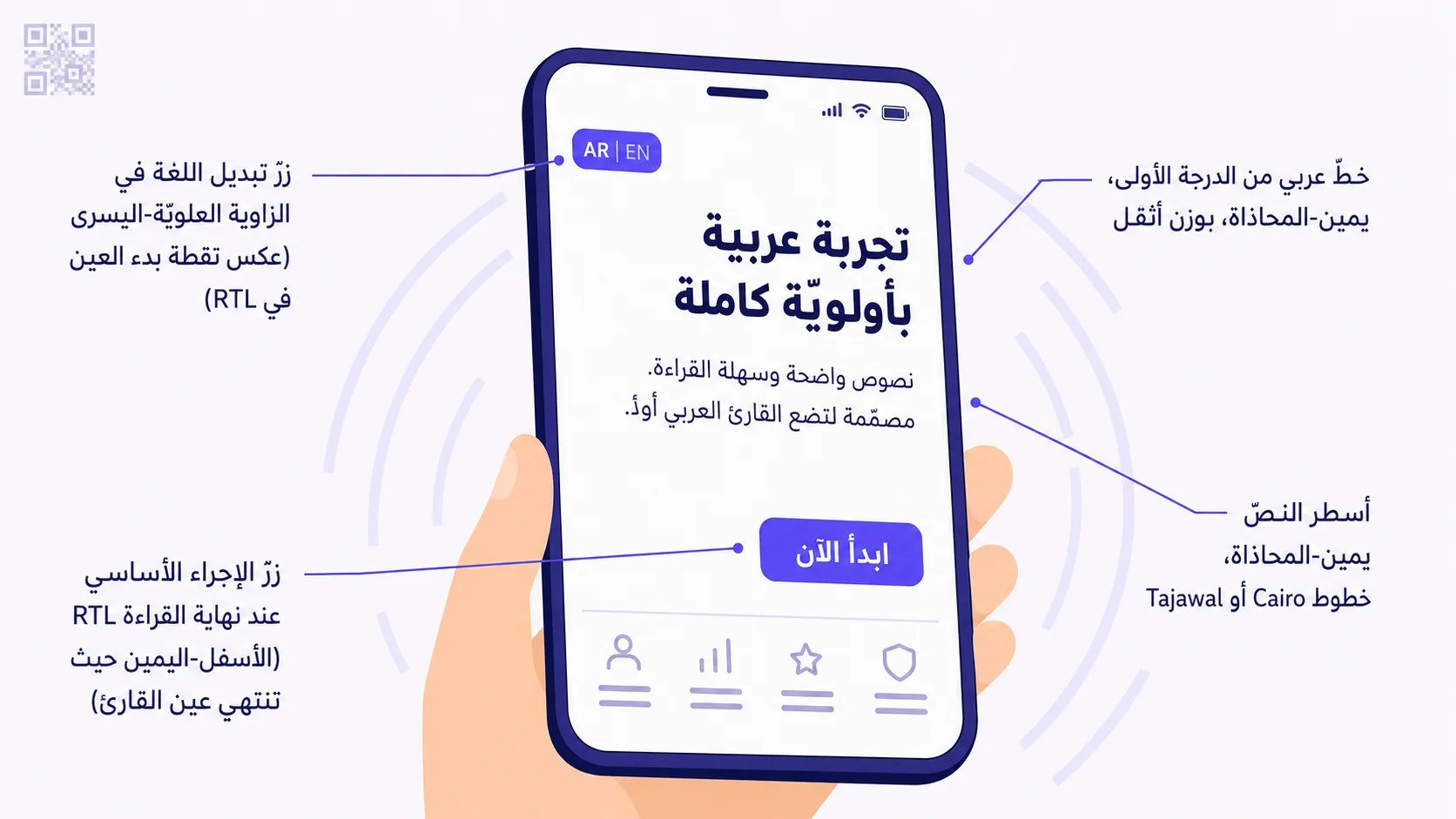
تهبط عيون قرّاء الإنجليزيّة على الزاوية العلويّة-اليسرى لأيّ صفحة. وتهبط عيون قرّاء العربيّة على الزاوية العلويّة-اليمنى. هذا أكثر الفروق أثراً، ويشكّل كلّ قرار تخطيط آخر. عنوان البطل، عنصر العلامة الأساسي، والتسلسل الهرمي البصري لاستدعاء الإجراء يجب أن يحترموا حيث تبدأ العين فعلاً. الشعار الذي يجلس في الزاوية العلويّة-اليسرى لتصميم إنجليزيّ-أوّلاً يحتاج إلى الانتقال إلى الزاوية العلويّة-اليمنى للعربيّة-أوّلاً — ليس فقط قلب موضعه عبر CSS، بل التصميم ليُقرأ كنقطة دخول الصفحة من تلك الجهة.
٢. نقطة نهاية القراءة وزرّ الإجراء الأساسي
يضع التصميم الإنجليزيّ-أوّلاً زرّ استدعاء الإجراء الأساسي على الزاوية السفليّة-اليسرى أو السفليّة-الوسطى من منطقة المحتوى، لأنّ ذلك هو حيث تنتهي عين قارئ LTR من مسح المحتوى أعلاه. والتصميم بالعربيّة-أوّلاً يضعه على الزاوية السفليّة-اليمنى — النهاية الطبيعيّة لتدفّق عين قارئ RTL. هذه إحدى أكثر القواعد انتهاكاً في تصميم ويب الشرق الأوسط. تشحن العلامات صفحات عربيّة مع CTA الأساسي لا يزال على اليسار، فيضطرّ القارئ العربي إلى إعادة مسح صغير لا إراديّ لإيجاده. ذلك الاحتكاك الدقيق يتراكم عبر الصفحة ويخفض التحويل بشكل ملموس.
٣. موضع زرّ تبديل اللغة
إن كانت صفحتك تتخلّف افتراضيّاً إلى العربيّة-الظاهرة وتعرض زرّ تبديل إنجليزي، فيجب أن يجلس ذلك الزرّ في الزاوية العلويّة-اليسرى — عكس نقطة بدء العين. السبب: زرّ اللغة عنصر «شبكة أمان»، يُستخدم حين لا يناسب الافتراضي القارئ. وضعه عكس نقطة بدء العين يجعله مرئيّاً في الرؤية الطرفيّة دون أن يتنافس على الانتباه الأساسي. عكسيّاً، على صفحة افتراضيّة-إنجليزيّة، يذهب زرّ التبديل العربي إلى الزاوية العلويّة-اليمنى (عكس بدء عين LTR). وظيفة الزرّ هي أن يكون قابلاً للإيجاد حين يُحتاج إليه، لا أن يهيمن حين لا يُحتاج إليه.
٤. وزن الخطّ وحجمه وعائلته
الخطّ العربي ليس مجموعة حروف مُترجَمة — هو نظام طباعي بتشريحه الخاصّ. الحروف العربيّة أكثر كثافة، أكثر أفقيّة، وتتطلّب إيقاعاً مختلفاً عن الحروف اللاتينيّة. ثلاثة آثار عمليّة:
- استخدم خطوطاً مصمَّمة عربيّاً (Cairo، Tajawal، IBM Plex Arabic، Noto Naskh Arabic، Frank Ruhl) بدلاً من الحروف العربيّة المُستبدَلة تلقائيّاً التي تظهر حين تضبط خطّاً لاتينيّاً مثل Helvetica أو Inter على محتوى عربي. الاستبدال التلقائي شبه دائماً أقبح من اختيار خطّ عربي مقصود.
- الخطّ العربي يُصيَّر عادةً أكبر من اللاتيني بحجم النصّ الأساسي نفسه — ارفع نصّ الجسم نقطة-نقطتَين (أو ١-٢ بكسل في CSS) للحفاظ على إيقاع القراءة. ١٤ بكسل لاتيني عادةً يقابل ١٥-١٦ بكسل عربي لراحة قابلة للمقارنة.
- الوزن الأثقل مقبول وغالباً مناسب للعناوين العربيّة بطريقة تشعر بالعدوانيّة في اللاتينيّة. حروف العربيّة تستطيع حمل وزن بصري دون أن تبدو صاخبة.
٥. ترتيب حقول النموذج وموضع التسمية
النماذج المصمَّمة بالعربيّة-أوّلاً تعكس ترتيب الحقول في الحقول المزدوجة أفقيّاً (الاسم-الأوّل + اسم-العائلة بترتيب عربي = اسم العائلة على اليمين، الاسم الأوّل على اليسار — عكس الاتّفاقيّة اللاتينيّة). تسميات فوق الحقول تبقى فوق؛ تسميات يسار الحقول تتحرّك إلى اليمين؛ النصّ النائب يحاذي اليمين؛ رسائل التحقّق تظهر بالمحاذاة والاتّجاه المناسبَين. حقول رقم الهاتف بقائمة منسدلة لرمز البلد تضع القائمة على يمين المُدخَل (عكس اتّفاقيّة LTR)، لأنّ عيون قرّاء العربيّة تعالج رمز البلد أوّلاً، ثمّ تسلسل الأرقام.
٦. الأرقام والتواريخ واتّجاه التقدّم
هذا يربك الجميع. النصّ العربي يُقرأ من اليمين إلى اليسار، لكنّ الأرقام العربيّة-الهنديّة (٠١٢٣٤٥٦٧٨٩) داخل النصّ العربي تُقرأ من اليسار إلى اليمين للأرقام متعدّدة الخانات (١٢٣ يُقرأ «مئة وثلاثة وعشرين»، نفس ما في الإنجليزيّة، مع الرقم الأوّل موضوعاً بصريّاً حيث تتوقّع). فسعر مثل «٥٠٠ ر.س» يُخطَّط بأرقام مرتّبة LTR داخل السطر RTL خلافاً لذلك. هذا يعني أنّ قواعد CSS تحتاج إلى التعامل مع المحتوى ثنائي الاتّجاه بشكل صحيح — خوارزميّة bidi للمتصفّح تفعل ذلك عادةً، لكنّ المصمّمين يحتاجون إلى التحقّق من أنّ التخطيط الناتج لا يكسر.
تنسيق التاريخ في الشرق الأوسط مختلط — الأرقام العربيّة (الغربيّة 1234567890) مقبولة على نطاق واسع بجانب العربيّة-الهنديّة. تتفاوت الاتّفاقيّة بحسب البلد: السعوديّة في الغالب أرقام غربيّة في السياقات التجاريّة، مصر والشام أكثر قليلاً نحو الهنديّة، والقطاع الخاصّ الخليجي عموماً ثنائي اللغة. تخلّف افتراضيّاً إلى الأرقام الغربيّة مع خيار الهنديّة كزرّ تبديل إن لم يكن تفضيل جمهورك واضحاً.
أشرطة التقدّم، ومؤشّرات الخطوات، ومسارات الفتات، وأزرار العودة كلّها تعكس الاتّجاه في RTL — الحركة الأماميّة يساريّة، والحركة الخلفيّة يمينيّة. مؤشّر خطوات «١ ← ٢ ← ٣» يصبح كذلك (يُقرأ من اليمين إلى اليسار، الأسهم تشير إلى اليسار، الخطوة الحاليّة عادةً الأيمن). تشحن العلامات واجهة التقدّم بأسهم لا تزال تشير إلى اليمين في الوضع العربي باستمرار. تبدو خاطئة للقرّاء الأصليّين.
٧. الأيقونات والرموز الاتّجاهيّة
معظم الأيقونات محايدة الاتّجاه وتعمل بالطريقة نفسها في أيّ تخطيط: هاتف، مظروف، كرة أرضيّة، نجمة. لكنّ الأيقونات الاتّجاهيّة تحتاج إلى الانعكاس: أيقونة سهم العودة المشيرة إلى اليسار في LTR تشير إلى اليمين في RTL؛ سهم الزرّ الأمامي يشير إلى اليسار في RTL؛ منحنى أيقونة «الردّ» يتعكّس. توجد حلول CSS-فقط (transform: scaleX(-1)) لكنّها لا تساعد إن كانت مجموعة أيقوناتك مرسومة يدويّاً بمنطق اتّجاهي مدمج. راجع مجموعة أيقوناتك للعناصر حاملة-الاتّجاه قبل إعلانها آمنة-RTL.
٨. إشارات الثقة المحلّيّة للمنطقة
إشارات الثقة التي تعمل في الشرق الأوسط تختلف عن تلك التي تعمل عالميّاً. أمثلة محدّدة تحرّك إبرة التحويل لجمهور الشرق الأوسط:
- شارات أنظمة الدفع المحلّيّة (مدى في السعوديّة، ميزا في مصر، كي-نت في الكويت، عاني في الإمارات) — قيمة ثقة أعلى بكثير من «نقبل فيزا وماستركارد».
- شارات شهادة الحلال حيث ينطبق (الطعام، الخدمات الماليّة، بعض المنتجات الاستهلاكيّة).
- أرقام السجلّ التجاري السعودي (CR)، تسجيل ضريبة القيمة المضافة، شارات الامتثال لـ ZATCA للتجارة الموجَّهة للسعوديّة.
- ساعات دعم العملاء ثنائيّة اللغة معروضة بالمنطقة الزمنيّة المحلّيّة (AST/AET/EET/CET حسب الانطباق).
- إشارات الثقة المتجنَّبة في بعض الأسواق الخليجيّة: صور غربيّة-علمانيّة معيّنة في تصوير المنتج (وضعيّات يوغا، بعض ملابس السباحة، صور قريبة من الكحول).
ماذا يتغيّر حين تنجح فيه
العلامات التي تنتقل من المُترجَم-من-الإنجليزيّة إلى صفحات هبوط بالعربيّة-أوّلاً حقيقيّاً ترى عادةً تحسينات تحويل ملموسة — تتفاوت الأرقام الدقيقة بالفئة والخطّ الأساسي، لكنّ النمط ثابت. تنتقل تجربة القارئ من «أستطيع فهم هذه الصفحة» إلى «هذه الصفحة لي». احتكاك التطابق الدقيق غير المتطابق (زرّ على الجهة الخاطئة، خطّ يشعر بالغرابة، زرّ تبديل اللغة يهيمن لأنّه على زاوية بدء العين) يختفي، والإجراء — الحجز، الشراء، المسح-للدفع، التسجيل، الاتّصال — يشعر بالطبيعيّة بدلاً من الجهد.
الاستثمار متواضع. إعادة تخطيط صفحة هبوط بالعربيّة-أوّلاً مهمّة مصمّم ١-٣ أيّام، لا إعادة بناء متعدّدة الأسابيع. العمل يتدرّج — بمجرّد أن تؤسّس متغيّرات مكوّن RTL في نظام التصميم، ترث كلّ صفحة هبوط لاحقة منها. الأولى مكلفة بساعات التصميم؛ والعاشرة تلقائيّة.
أين تحتاج وجهات QR تحديداً إلى هذا الاهتمام
ثلاثة سياقات لوجهة QR حيث يهمّ التصميم بالعربيّة-أوّلاً بشكل غير متناسب:
قوائم المطاعم والضيافة
ضيف على طاولة مقهى في الرياض أو القاهرة أو دبي يمسح قائمة QR في لحظة احتكاك-غير-متسامحة. يجب أن تشعر صفحة الوجهة كالمقهى، باتّجاه قراءة الضيف، بتدفّق العين الذي يطابق كيف يتوقّع مسح قائمة. القوائم بالعربيّة-أوّلاً تفتح إلى المحتوى العربي ظاهراً، مع الإنجليزيّة متاحة — لا العكس.
صفحات هبوط الحملات التسويقيّة
حملة QR تحوّل بنصف إمكاناتها لأنّ التصميم فضّل قرّاء الإنجليزيّة تترك مالاً حقيقيّاً على الطاولة. النسخ المحلّيّة بالعربيّة-أوّلاً من صفحات الحملات تتفوّق روتينيّاً على نظرائها المُترجَمَة-مباشرةً، وتكلفة النشر تدريجيّة بما أنّ الحملة الأساسيّة موجودة بالفعل.
صفحات دفع QR
احتكاك الدفع يهمّ أكثر من أيّ مكان آخر — كلّ شكّ دقيق يختبره الزائر أثناء المحاسبة يصبح سلّة مهجورة. تدفّقات المحاسبة بالعربيّة-أوّلاً تشعر بالألفة؛ شارات ثقة مدى/ميزا/كي-نت بنصّها الأصلي؛ أرقام دعم محلّيّ ثنائيّة اللغة؛ تنسيق تاريخ ومبلغ صحيح-bidi؛ كلّها تتدفّق إلى معدّل الإتمام.
أنماط شائعة لتجنّبها
- اكتشاف اللغة تلقائيّاً بمحلّيّة المتصفّح وفرضها دون زرّ تبديل مرئي — كثير من مستخدمي الشرق الأوسط يبقون هاتفهم بالإنجليزيّة بينما يقرؤون العربيّة، واللغة-بالمحلّيّة تخطئها باستمرار.
- استخدام Helvetica أو Arial أو Inter للمحتوى العربي — الحروف العربيّة المُستبدَلة تلقائيّاً تبدو رخيصة.
- نسيان قلب اتّجاه الأيقونة — أكثر منتهك شائع: أيقونات سهم العودة التي تشير إلى اليسار في كلا تخطيطَي EN و AR.
- إرسال نموذج وعرض حالة نجاح لا تزال يساريّة-المحاذاة في عرض RTL لأنّ مكوّن النجاح لم يُراجَع.
- أرقام تنقلب الاتّجاه الخاطئ — رقم هاتف مثل +966 50 123 4567 يجب ألّا يصبح 7654 321 50 669+ حين تذهب الصفحة إلى RTL.
- رموز العملة على الجانب الخاطئ — SAR يجلس بعد الرقم بالعربيّة («٥٠٠ ر.س» أو «500 ر.س»)، لا قبله.
كيف تتعامل QRA مع صفحات الوجهة
صفحات وجهة QR في QRA تُصيَّر بالعربيّة-أوّلاً افتراضيّاً مع زرّ تبديل إنجليزي في الزاوية العلويّة-اليسرى — عكس كيف تتعامل معظم SaaS العالميّة مع الشرق الأوسط. الخطّ يتخلّف افتراضيّاً إلى عائلة Cairo / Tajawal العربيّة؛ الأرقام تحترم صحّة bidi؛ أزرار CTA الأساسيّة تجلس على الأسفل-اليمين عند نهاية RTL؛ حقول النموذج وتسمياتها تنقلب بشكل صحيح للمدخلات المزدوجة؛ شارات الثقة (مدى / ميزا / كي-نت / VAT / CR / ZATCA) تُصيَّر بنصّها الأصلي. لصفحات الوجهة بـ HTML/CSS مخصّصة مستضافة خارج QRA، توفّر المنصّة قوالب مكوّن RTL ومراجعة تصميم بالعربيّة-أوّلاً كجزء من تأهيل المستوى الاحترافي.
الإجابة المختصرة
التصميم بالعربيّة-أوّلاً ليس ترجمة. هو الخطّ، التخطيط، تدفّق العين، موضع الأزرار، سلوك النموذج، الأيقونات، واختيار إشارة الثقة كلّها معامَلة من الدرجة الأولى لقرّاء العربيّة، مع تسهيل قرّاء الإنجليزيّة عبر تخطيط موازٍ وزرّ تبديل لغة في الزاوية العلويّة-اليسرى. الاستثمار متواضع؛ ورفعة التحويل حقيقيّة ومستمرّة. لأيّ حملة QR موجَّهة للشرق الأوسط، صفحة الوجهة هي اللحظة التي يقرّر فيها الزائر ما إذا كان سيتصرّف — صمّم تلك اللحظة لهم، لا عليهم. الترجمة هي الجهد الابتدائي؛ والعربيّة-أوّلاً هي العمل الذي يتراكم فعلاً.
Ready to make a smarter QR?جاهز لإنشاء رمز QR أذكى؟
Sign up free — no card needed. Track every scan, edit destinations anytime.سجّل مجاناً — بدون بطاقة. تتبّع كل عملية مسح وعدّل الوجهة في أي وقت.