Why Your Custom-Logo QR Code Won't Scan (And How to Fix It Without Removing the Logo)لماذا لا يُمسح رمز QR بشعارك المخصّص (وكيف تصلحه دون إزالة الشعار)
Branding teams add a logo to the QR centre, the design feels on-brand, the QR scans on the designer's iPhone, the print run goes out — and then 30% of customers can't scan it. The logo isn't the problem; the logo size, the safe-zone, and the error-correction level are. Here's exactly why custom-logo QRs fail and the three-rule fix that works without removing the logo.تضيف فرق العلامة التجاريّة شعاراً إلى مركز رمز QR، يبدو التصميم متوافقاً مع العلامة، يُمسح الرمز على آيفون المصمّم، تنطلق دفعة الطباعة — ثمّ ٣٠٪ من العملاء لا يستطيعون مسحه. الشعار ليس المشكلة؛ المشكلة هي حجم الشعار، المنطقة الآمنة، ومستوى تصحيح الأخطاء. إليك بالضبط لماذا تفشل رموز QR بشعار مخصّص وقاعدة الثلاث-إصلاحات التي تعمل دون إزالة الشعار.
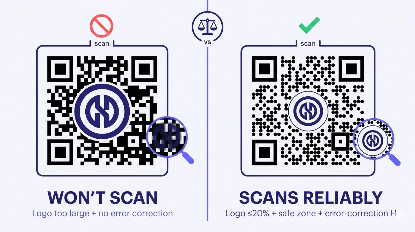
A QR code with the brand's logo dropped into the centre is the visual that every marketing director wants. It looks polished, it looks intentional, it ties the QR to the brand identity instead of leaving a generic black-square dot pattern on the design. So the designer drops the logo in, exports the QR, the marketing director scans it on their iPhone, it works, the print run goes out — and then customer support starts getting complaints that 30% of recipients can't scan it. The logo isn't the problem. The way the logo was inserted is.
There are three rules that determine whether a logo-embedded QR works reliably. Almost every failure comes down to one of them being violated. Designers who learned QR generation through ad-hoc free tools have no way to know the rules — the tools don't enforce them, the failure mode is asymmetric (works on iPhone, breaks on a 2-year-old Android), and the bug surfaces after print. This piece walks through what's actually happening, the three rules, and how to fix custom-logo QRs without removing the logo.
What's actually happening when a logo breaks a QR
A QR code is a precisely-specified grid of black and white modules (the 'dots'). The camera scanning the QR uses three position-detection patterns in the corners to find the QR's orientation, then reads every module's black-or-white state to decode the data. The QR's built-in Reed-Solomon error correction lets some modules be unreadable — at level L it tolerates ~7% damage, at L it tolerates ~30% — but only up to that level. Beyond the tolerance, the scan fails.
A logo placed in the centre of the QR obscures the modules underneath it. From the camera's perspective, those modules are 'damaged' — the logo's colours don't match the black-or-white module state the QR's bitstream expects, so the decoder treats those modules as unreadable. The bigger the logo, the more modules obscured, the more 'damage' the error correction has to absorb. Past the threshold, the math fails and the scan returns no result.
There's a second, more subtle problem when there's no 'safe zone' between the logo and the QR modules: the modules at the boundary of the logo are not fully obscured but not fully visible either — half-covered. The camera's interpretation of these boundary modules becomes unreliable, sometimes reading them as black, sometimes as white, depending on the camera's angle, lighting, and processing pipeline. Different phone models interpret these ambiguous boundary modules differently. This is why a logo-embedded QR can scan reliably on iPhone (whose camera ML is more permissive) and fail on a budget Android (whose ML is stricter).
The three rules
Rule 1 — Logo size: ≤20% of QR width
The single most-violated rule. A logo larger than ~20-22% of the QR's width starts to obscure too many modules for even the highest error-correction level to fully recover. Designers who haven't seen this rule treat the centre of the QR as 'free design space' and push the logo to 35-40% of the width, because at that size the brand mark feels right. The QR then scans only on the most-permissive phones; the rest fail.
The 20% maximum is conservative but reliable. Some QRs survive up to 25% with very-high error-correction and clean module patterns, but the asymmetric phone-camera variability means 20% is the threshold below which scan reliability stays high across phone models. If your designer feels 20% is too small, the answer isn't to push beyond 20% — it's to make the QR itself physically bigger so the 20% logo is also bigger.
Rule 2 — Safe zone: clean white cutout around the logo
The QR modules underneath and immediately around the logo should be REMOVED, not just covered. Most QR generators do this by 'cutting out' a circular or rounded-square region in the QR pattern where the logo will sit, leaving clean white space behind the logo. The logo then sits in that clean area with a thin border between the logo edge and the surrounding modules. The boundary-ambiguity problem disappears — every module the camera reads is either clearly black or clearly white, never half-covered.
The safe zone should extend 2-4 modules beyond the logo's actual visible edge. Most QR generators handle this automatically; some don't. If your generator overlays the logo on top of an unchanged QR pattern (rather than cutting the pattern away first), the QR will exhibit the asymmetric-phone-failure behaviour even if the logo is within size limits. Switch generators.
Rule 3 — Error-correction level: H (30%)
QR codes support four error-correction levels: L (~7% redundancy), M (~15%), Q (~25%), and H (~30%). The default in most QR generators is M, which is fine for a plain QR with no logo but borderline-insufficient for a logo-embedded QR even with the size and safe-zone rules respected. For any logo-embedded QR, set the error-correction level to H during generation. This adds redundancy to the QR's encoded bitstream, so when the safe-zone cutout removes modules, there's enough redundant data elsewhere in the pattern that the decoder can still reconstruct the original payload.
The cost of error-correction H is that the QR itself becomes slightly larger (more modules needed to encode the same data with more redundancy). For a typical short URL, level H increases the QR from ~Version 3 (29×29 modules) to ~Version 4-5 (33×33 or 37×37 modules). At a printed size of 3-4 cm, the difference is barely visible. The reliability gain is large.
Three rules, one example
Concrete numbers. You're generating a QR that will be printed at 4 cm wide. The brand wants the logo in the centre.
- Maximum logo width: 20% of 4 cm = 0.8 cm. The logo's visible mark should fit inside a 0.8 cm square area (or a 0.9 cm circle for a circular logo).
- Safe-zone cutout: extends 2-4 modules beyond the logo edge. At a 4 cm QR with ~33 modules across (Version 4 at error-correction H), each module is ~1.2 mm. A 3-module safe-zone margin = ~3.6 mm. The total clean area in the QR centre is roughly 0.8 cm + 0.7 cm (extra 3.5 mm on each side) = ~1.5 cm.
- Error-correction level: H. Generate the QR explicitly at level H, do not accept the default.
Print the result at 4 cm. Test on three phones (one iPhone, one mid-range Samsung, one mid-range Xiaomi/Huawei/Oppo). If all three scan reliably from 25-30 cm away, the production run is cleared.
When the rules aren't enough — secondary fixes
If you've followed the three rules and a logo-embedded QR still has scan issues, the secondary suspects are:
Logo colour conflicts with QR module colour
If the QR modules are dark indigo (not pure black) and your logo is also dark indigo, the boundary modules — even with a safe zone — can blend visually under certain lighting. Increase the contrast: keep QR modules pure black and the logo a clearly different colour, OR keep the logo dark and the QR background clearly white (not off-white). The visual elegance of the brand palette can fight the QR's scan-reliability requirements; tune the colours so they're brand-on but scan-clean.
Logo has fine detail that visually competes with module pattern
A logo with intricate fine lines (calligraphic Arabic logotypes, detailed crests, fine-line illustrative marks) can visually 'connect' to the surrounding QR module pattern at small print sizes, confusing the camera even with proper safe-zone separation. Simplify the in-QR version of the logo — use a more iconographic or geometric simplification of the brand mark specifically for the QR-centre placement. Keep the full intricate logo for everywhere else on the design.
Print quality on the actual material
Even with perfect three-rules generation, a logo-embedded QR printed on absorbent material (uncoated cardstock, kraft paper) can develop ink bleed at the logo edge, contaminating the safe-zone. Test on the actual print material before committing. For absorbent or textured material, increase the QR size by 15-20% to compensate.
What designers should NEVER do
- Drop a logo into a QR in Photoshop without using a QR-aware tool that creates the safe-zone cutout. Photoshop will happily overlay the logo on top of intact QR modules — the file looks right; the scan fails.
- Resize the logo to fit a 'designer judgment' size larger than 20% because 'it looks better that way'. Designer judgment ≠ scan reliability. Both can be right; you need a tool that enforces both.
- Skip the multi-phone test before printing. The single-iPhone-on-the-designer's-desk test is the most common pre-failure pattern.
- Use a logo with detail that competes with QR module size — simplify the in-QR variant.
- Default to error-correction level M because the generator's UI hides the H option. Find the option; set it.
What's actually achievable with logo-embedded QR
Done right, a logo-embedded QR is essentially indistinguishable in scan reliability from a plain QR. Major MENA brands use them at scale on packaging, signage, business cards, and marketing collateral without scan problems. The reliability comes from the three rules, not from special technology. Any QR-generation tool that enforces the three rules automatically produces logo-QRs that work; any tool that doesn't requires the designer to enforce them manually — and most designers don't know the rules exist.
How QRA handles logo-embedded QR
QRA enforces all three rules by default. When you upload a logo into the QR generator, the platform automatically: sizes the logo to fit ≤20% of QR width (with a manual override for designers who want to push to 22% on specific high-contrast use cases); creates a safe-zone cutout with appropriate margin around the logo edge; sets error-correction to level H whenever a logo is present. The exported QR (PNG, SVG, EPS) embeds the logo as vector geometry, preserving sharpness at any print scale. Multi-phone scan testing is built into the preview — the platform suggests testing against a real device library before committing the design to print.
The short answer
Custom-logo QRs fail when the logo is too big, when there's no safe-zone cutout, or when error-correction was left at the default. Fix is three rules: logo ≤20% of QR width, clean white cutout around the logo extending 2-4 modules beyond its edge, error-correction level H. Use a QR generator that enforces these automatically (most don't). Test on at least three phones (especially mid-range Androids) before printing. The logo stays in the QR; the scan reliability comes back; the brand and the engineering both win.
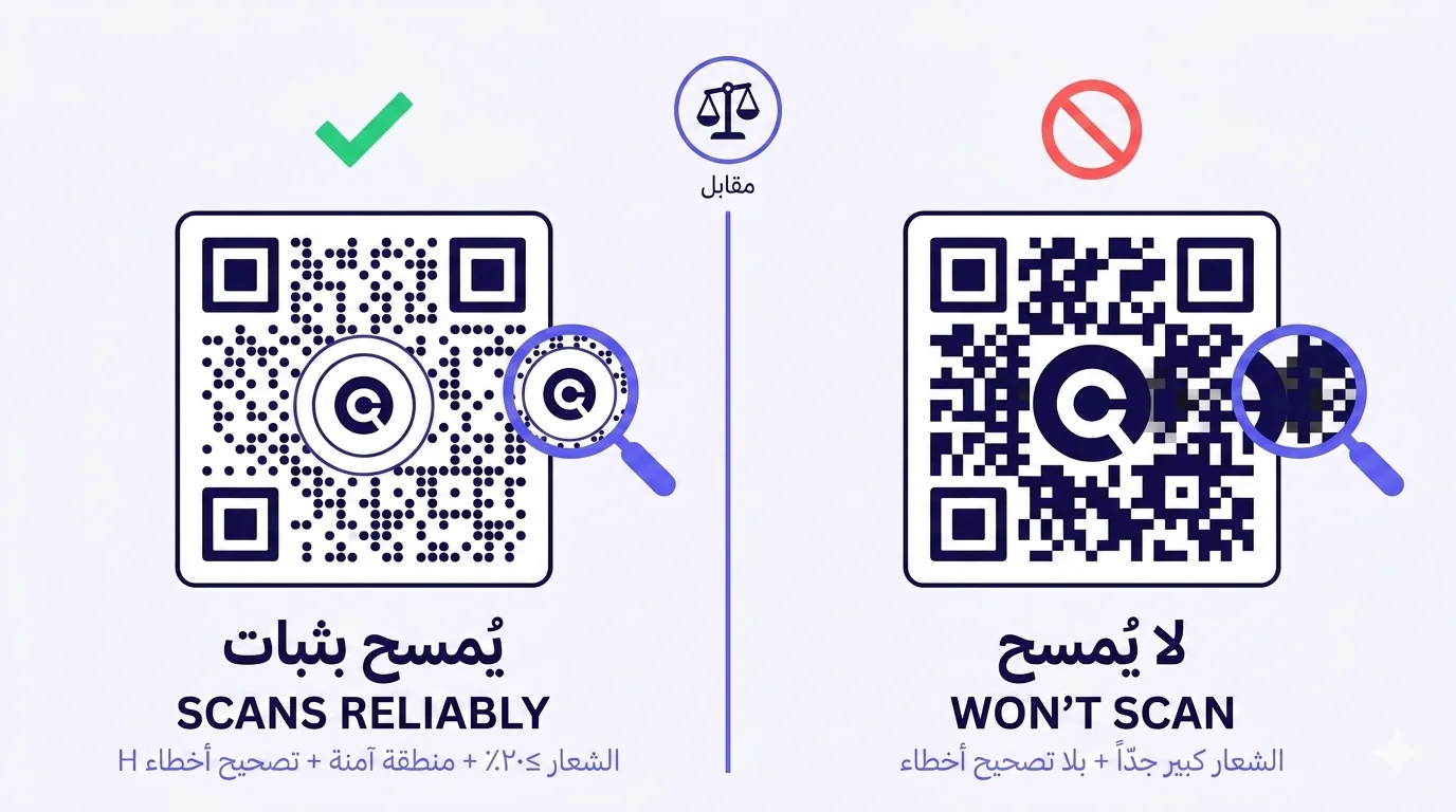
رمز QR مع شعار العلامة في المنتصف هو البصريّة التي يريدها كلّ مدير تسويق. يبدو مصقولاً، يبدو مقصوداً، يربط QR بهويّة العلامة بدلاً من ترك نمط نقاط مربّعة سوداء عامّ على التصميم. فيُسقط المصمّم الشعار، يصدّر QR، يمسحه مدير التسويق على آيفونه، يعمل، تنطلق دفعة الطباعة — ثمّ يبدأ دعم العملاء يستقبل شكاوى أنّ ٣٠٪ من المتلقّين لا يستطيعون مسحه. الشعار ليس المشكلة. الطريقة التي أُدخل بها الشعار هي المشكلة.
هناك ثلاث قواعد تحدّد ما إذا كان رمز QR بشعار مدمج يعمل بثبات. تقريباً كلّ فشل يعود إلى انتهاك إحداها. المصمّمون الذين تعلّموا توليد QR عبر أدوات مجّانيّة ارتجاليّة ليس لديهم طريقة لمعرفة القواعد — الأدوات لا تفرضها، نمط الفشل غير متماثل (يعمل على آيفون، ينكسر على أندرويد عمره سنتان)، ويظهر الخطأ بعد الطباعة. هذا المقال يمشي عبر ما يحدث فعلاً، القواعد الثلاث، وكيف تصلح رموز QR بشعار مخصّص دون إزالة الشعار.
ما يحدث فعلاً حين يكسر شعار رمز QR
رمز QR هو شبكة محدّدة بدقّة من الوحدات السوداء والبيضاء («النقاط»). تستخدم الكاميرا الماسحة لـ QR ثلاثة أنماط كشف موضع في الزوايا لإيجاد اتّجاه QR، ثمّ تقرأ حالة كلّ وحدة من أسود-أو-أبيض لفكّ ترميز البيانات. تصحيح الأخطاء Reed-Solomon المدمج في QR يتيح لبعض الوحدات أن تكون غير قابلة للقراءة — في المستوى L يتحمّل ~٧٪ ضرر، في L يتحمّل ~٣٠٪ — لكن فقط حتّى ذلك المستوى. ما وراء التحمّل، يفشل المسح.
شعار موضوع في وسط QR يحجب الوحدات تحته. من منظور الكاميرا، تلك الوحدات «تالفة» — ألوان الشعار لا تطابق حالة وحدة أسود-أو-أبيض التي يتوقّعها تيّار بتّات QR، فيعامل المُفكّك تلك الوحدات كغير قابلة للقراءة. كلّما كبر الشعار، حُجبت وحدات أكثر، احتاج تصحيح الأخطاء إلى امتصاص «ضرر» أكثر. وراء العتبة، تفشل الرياضيّات ويعيد المسح نتيجة لا شيء.
هناك مشكلة ثانية، أكثر دقّة، حين لا توجد «منطقة آمنة» بين الشعار ووحدات QR: الوحدات على حدود الشعار ليست محجوبة بالكامل ولا مرئيّة بالكامل — نصف-مغطّاة. تفسير الكاميرا لهذه الوحدات الحدّيّة يصبح غير موثوق، أحياناً تقرأها كسوداء، أحياناً كبيضاء، بحسب زاوية الكاميرا والإضاءة وأنبوب المعالجة. موديلات الهواتف المختلفة تفسّر هذه الوحدات الحدّيّة الغامضة بشكل مختلف. هذا لماذا يمكن لرمز QR بشعار مدمج أن يُمسح بثبات على آيفون (الذي يكون تعلّم آلته بالكاميرا أكثر تسامحاً) ويفشل على أندرويد اقتصادي (الذي يكون تعلّم آلته أكثر صرامة).
القواعد الثلاث
القاعدة ١ — حجم الشعار: ≤٢٠٪ من عرض QR
القاعدة الأكثر انتهاكاً. شعار أكبر من ~٢٠-٢٢٪ من عرض QR يبدأ بحجب وحدات أكثر ممّا يستطيع حتّى أعلى مستوى تصحيح أخطاء استعادته كاملاً. المصمّمون الذين لم يروا هذه القاعدة يعاملون مركز QR كـ«مساحة تصميم حرّة» ويدفعون الشعار إلى ٣٥-٤٠٪ من العرض، لأنّ علامة العلامة بذلك الحجم تشعر صحيحة. ثمّ يُمسح QR فقط على الهواتف الأكثر تسامحاً؛ وتفشل البقيّة.
الحدّ الأقصى ٢٠٪ متحفّظ لكن موثوق. تنجو بعض رموز QR حتّى ٢٥٪ مع تصحيح أخطاء عالٍ جدّاً وأنماط وحدات نظيفة، لكنّ تباين كاميرا الهاتف غير المتماثل يعني أنّ ٢٠٪ هي العتبة التي تبقى تحتها موثوقيّة المسح عالية عبر موديلات الهواتف. إن شعر مصمّمك بأنّ ٢٠٪ صغير جدّاً، فالجواب ليس الدفع وراء ٢٠٪ — هو جعل QR نفسه أكبر فيزيائيّاً لكي يكون الشعار بـ ٢٠٪ أكبر أيضاً.
القاعدة ٢ — المنطقة الآمنة: قطع أبيض نظيف حول الشعار
وحدات QR تحت الشعار وحوله مباشرةً يجب أن تُزال، لا أن تُغطّى فقط. معظم مولّدات QR تفعل ذلك بـ«قطع» منطقة دائريّة أو مربّعة ذات زوايا مدوّرة في نمط QR حيث سيجلس الشعار، تاركةً مساحة بيضاء نظيفة خلف الشعار. يجلس الشعار بعدها في تلك المنطقة النظيفة بحدود رفيعة بين حافّة الشعار والوحدات المحيطة. مشكلة الغموض الحدّي تختفي — كلّ وحدة تقرؤها الكاميرا إمّا سوداء بوضوح أو بيضاء بوضوح، أبداً ليست نصف-مغطّاة.
المنطقة الآمنة يجب أن تمتدّ ٢-٤ وحدات وراء حافّة الشعار المرئيّة الفعليّة. معظم مولّدات QR تتعامل مع هذا تلقائيّاً؛ بعضها لا يفعل. إن كان مولّدك يطبق الشعار فوق نمط QR غير المتغيّر (بدلاً من قطع النمط أوّلاً)، سيظهر QR سلوك فشل-الهاتف-غير-المتماثل حتّى لو كان الشعار ضمن حدود الحجم. بدّل المولّدات.
القاعدة ٣ — مستوى تصحيح الأخطاء: H (٣٠٪)
رموز QR تدعم أربعة مستويات تصحيح أخطاء: L (~٧٪ تكرار)، M (~١٥٪)، Q (~٢٥٪)، و H (~٣٠٪). الافتراضي في معظم مولّدات QR هو M، الذي يكون جيّداً لـ QR عاديّ بلا شعار لكنّه على الحافّة-غير-كافٍ لرمز QR بشعار مدمج حتّى مع احترام قواعد الحجم والمنطقة الآمنة. لأيّ QR بشعار مدمج، اضبط مستوى تصحيح الأخطاء على H أثناء التوليد. هذا يضيف تكراراً لتيّار بتّات QR المُرمَّز، فحين يزيل قطع المنطقة الآمنة وحدات، توجد بيانات متكرّرة كافية في مكان آخر من النمط لكي يستطيع المُفكّك إعادة بناء الحمولة الأصليّة.
تكلفة تصحيح الأخطاء H هي أنّ QR نفسه يصبح أكبر قليلاً (وحدات أكثر مطلوبة لترميز نفس البيانات مع تكرار أكثر). لرابط قصير نموذجي، المستوى H يزيد QR من ~الإصدار ٣ (٢٩×٢٩ وحدة) إلى ~الإصدار ٤-٥ (٣٣×٣٣ أو ٣٧×٣٧ وحدة). في حجم طباعة ٣-٤ سم، الفرق بالكاد مرئي. ومكسب الموثوقيّة كبير.
ثلاث قواعد، مثال واحد
أرقام ملموسة. تولّد QR سيُطبع بعرض ٤ سم. تريد العلامة الشعار في المنتصف.
- الحدّ الأقصى لعرض الشعار: ٢٠٪ من ٤ سم = ٠٫٨ سم. علامة الشعار المرئيّة يجب أن تتّسع داخل منطقة مربّعة ٠٫٨ سم (أو دائرة ٠٫٩ سم لشعار دائري).
- قطع المنطقة الآمنة: يمتدّ ٢-٤ وحدات وراء حافّة الشعار. في QR ٤ سم بـ ~٣٣ وحدة عرضاً (الإصدار ٤ في تصحيح أخطاء H)، كلّ وحدة ~١٫٢ ملم. هامش منطقة آمنة بـ ٣ وحدات = ~٣٫٦ ملم. المساحة النظيفة الكاملة في وسط QR هي تقريباً ٠٫٨ سم + ٠٫٧ سم (٣٫٥ ملم إضافيّة على كلّ جانب) = ~١٫٥ سم.
- مستوى تصحيح الأخطاء: H. ولّد QR صراحةً بالمستوى H، لا تقبل الافتراضي.
اطبع النتيجة بحجم ٤ سم. اختبر على ثلاثة هواتف (آيفون واحد، سامسونغ متوسّط، شاومي/هواوي/أوبو متوسّط). إن مسحت الثلاثة بثبات من ٢٥-٣٠ سم بعيداً، فدفعة الإنتاج جاهزة.
حين لا تكفي القواعد — إصلاحات ثانويّة
إن اتّبعت القواعد الثلاث ولا يزال لرمز QR بشعار مدمج مشكلات مسح، فالمشتبه بهم الثانويّون هم:
تضارب لون الشعار مع لون وحدة QR
إن كانت وحدات QR نيليّة داكنة (لا أسود نقي) وشعارك أيضاً نيليّ داكن، يمكن للوحدات الحدّيّة — حتّى مع منطقة آمنة — أن تمتزج بصريّاً تحت إضاءة معيّنة. ارفع التباين: أبقِ وحدات QR أسود نقي والشعار بلون مختلف بوضوح، أو أبقِ الشعار داكناً وخلفيّة QR أبيض بوضوح (لا أبيض مائل للوردي). الأناقة البصريّة للوحة العلامة يمكن أن تقاتل متطلّبات موثوقيّة مسح QR؛ اضبط الألوان لتكون متوافقة-مع-العلامة لكن نظيفة-للمسح.
الشعار يحوي تفاصيل دقيقة تتنافس بصريّاً مع نمط الوحدات
شعار بخطوط دقيقة معقّدة (شعارات خطّيّة عربيّة، شعارات تفصيليّة، علامات توضيحيّة بخطوط دقيقة) يمكن أن يتّصل بصريّاً بنمط وحدات QR المحيط عند أحجام طباعة صغيرة، فيربك الكاميرا حتّى مع فصل منطقة آمنة مناسب. بسّط النسخة-في-QR من الشعار — استخدم تبسيطاً أيقونيّاً أو هندسيّاً أكثر لعلامة العلامة خصيصاً لوضع وسط-QR. أبقِ الشعار التفصيلي الكامل لكلّ مكان آخر في التصميم.
جودة الطباعة على المادّة الفعليّة
حتّى مع توليد ثلاث-قواعد مثالي، يمكن لـ QR بشعار مدمج مطبوع على مادّة ماصّة (ورق مقوّى غير مطلي، ورق كرافت) أن يطوّر نزف حبر عند حافّة الشعار، فيلوّث المنطقة الآمنة. اختبر على مادّة الطباعة الفعليّة قبل الالتزام. للمادّة الماصّة أو الملمسة، زد حجم QR بنسبة ١٥-٢٠٪ للتعويض.
ما يجب على المصمّمين ألّا يفعلوه أبداً
- إسقاط شعار في QR في Photoshop دون استخدام أداة واعية بـ QR تنشئ قطع المنطقة الآمنة. Photoshop سيضع الشعار بسعادة فوق وحدات QR السليمة — يبدو الملفّ صحيحاً؛ يفشل المسح.
- تغيير حجم الشعار ليناسب حجم «حكم المصمّم» الأكبر من ٢٠٪ لأنّه «يبدو أفضل بتلك الطريقة». حكم المصمّم ≠ موثوقيّة المسح. كلاهما يمكن أن يكون صحيحاً؛ تحتاج إلى أداة تفرض كليهما.
- تخطّي اختبار الهواتف المتعدّدة قبل الطباعة. اختبار الآيفون-الواحد-على-مكتب-المصمّم هو أكثر نمط فشل سابق شائع.
- استخدام شعار بتفصيل يتنافس مع حجم وحدة QR — بسّط متغيّر داخل-QR.
- التخلّف افتراضيّاً إلى مستوى تصحيح أخطاء M لأنّ واجهة المولّد تخفي خيار H. اعثر على الخيار؛ اضبطه.
ما هو قابل للتحقيق فعلاً برمز QR بشعار مدمج
حين يُفعل بشكل صحيح، رمز QR بشعار مدمج لا يكاد يميَّز في موثوقيّة المسح عن QR عاديّ. تستخدمها العلامات الكبرى في الشرق الأوسط على نطاق واسع على التغليف، اللافتات، بطاقات العمل، والمواد التسويقيّة دون مشاكل مسح. تأتي الموثوقيّة من القواعد الثلاث، لا من تقنيّة خاصّة. أيّ أداة توليد QR تفرض القواعد الثلاث تلقائيّاً تنتج رموز QR بشعار تعمل؛ وأيّ أداة لا تفعل تتطلّب من المصمّم فرضها يدويّاً — ومعظم المصمّمين لا يعرفون أنّ القواعد موجودة.
كيف تتعامل QRA مع QR بشعار مدمج
QRA تفرض القواعد الثلاث افتراضيّاً. حين ترفع شعاراً في مولّد QR، تقوم المنصّة تلقائيّاً بـ: تحديد حجم الشعار ليتّسع ≤٢٠٪ من عرض QR (مع تجاوز يدوي للمصمّمين الذين يريدون الدفع إلى ٢٢٪ في حالات استخدام عالية التباين محدّدة)؛ إنشاء قطع منطقة آمنة بهامش مناسب حول حافّة الشعار؛ ضبط تصحيح الأخطاء على المستوى H كلّما كان الشعار حاضراً. QR المُصدَّر (PNG، SVG، EPS) يدمج الشعار كهندسة متّجهيّة، محافظاً على الحدّة بأيّ مقياس طباعة. اختبار المسح متعدّد الهواتف مدمج في المعاينة — تقترح المنصّة الاختبار مقابل مكتبة أجهزة حقيقيّة قبل الالتزام بالتصميم للطباعة.
الإجابة المختصرة
رموز QR بشعار مخصّص تفشل حين يكون الشعار كبيراً جدّاً، أو حين لا يوجد قطع منطقة آمنة، أو حين تُرك تصحيح الأخطاء على الافتراضي. الإصلاح ثلاث قواعد: الشعار ≤٢٠٪ من عرض QR، قطع أبيض نظيف حول الشعار يمتدّ ٢-٤ وحدات وراء حافّته، مستوى تصحيح أخطاء H. استخدم مولّد QR يفرض هذه تلقائيّاً (معظمها لا يفعل). اختبر على ثلاثة هواتف على الأقلّ (خاصّةً أندرويد متوسّط) قبل الطباعة. يبقى الشعار في QR؛ تعود موثوقيّة المسح؛ تفوز العلامة والهندسة كلتاهما.
Ready to make a smarter QR?جاهز لإنشاء رمز QR أذكى؟
Sign up free — no card needed. Track every scan, edit destinations anytime.سجّل مجاناً — بدون بطاقة. تتبّع كل عملية مسح وعدّل الوجهة في أي وقت.